After the recent launch of the new commemorative Cork GAA jersey, DENIS HURLEY counts down his top five Cork GAA jerseys
***
5. 1994-96: After decades of relative stability, the mid-1990s saw GAA jerseys become more adventurous as a growing replica market demanded more noticeable changes with each new release. In the years previously, O’Neills had included the Cork crest on the sleeves but the introduction of the new GAA logo on the right breast of all counties’ tops saw a change with the inclusion of stripes of varying lengths and a large white band from the shoulder to the armpit. When sponsorship was introduced in 1991, Cork’s first partnership was with Barry’s Tea and their logo fitted perfectly on the chests of the Cork players.
ADVERTISEMENT
***
4. 2019-20 change: By and large, Cork’s alternative shirts have been simple reversals of the red offerings, dating back to the 1973 All-Ireland football final win over Galway – prior to that, the blue of Munster had been worn when colour-clashes arose. While these white shirts were often quite attractive, the lack of deviation was also quite boring, but in 2019 O’Neills went in a new direction. The make-up of the white jersey was largely similar to the red one, but an added dimension was a red yoke across the shoulders. Also helping was the fact that the Chill Insurance logo doesn’t look quite as offensive on a white shirt, with the red ones having to display the emblem on a white background.
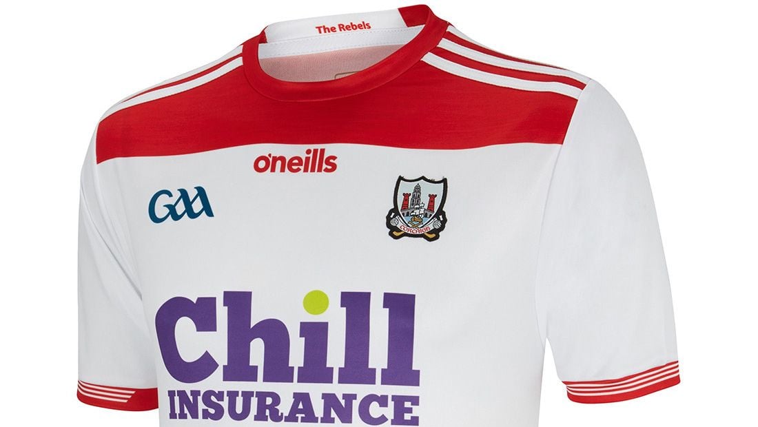 The current alternative white Cork jersey is easy on the eye.
***
3. 2002-04: At the turn of the millennium, O’Neills added navy trim to the Cork jersey and, while one delegate at a county board meeting lamented the fact that the colours of the Union flag were now on show, it was an attractive addition. The ship and water from Cork’s crest were rendered in white and navy on the new jersey introduced in 2000 and this theme was expanded for its successor in 2002, the first to feature the logo of new sponsors O2, the global telecommunications firm having taken over Esat Digifone. White and navy trim on the arms and sides made for a clean look, with the next shirt after that – worn for the 2004 and 2005 All-Ireland hurling wins – a notable regression.
***
2. 1984 All-Ireland hurling final: There can be a tendency to give shirts a ‘success bonus’, namely ranking them higher than they objectively should be because they were worn for big wins. However, as with number 1 (see below), this would be a classic even if Offaly had triumphed on that September day in Thurles. To mark the centenary of the GAA, Cork appeared in jerseys featuring a crest for the first time – worn on the right breast, with the blue and gold GAA logo on the left-hand side. Added to that was the ‘Corcaigh’ writ large across the chest. It’s little wonder that reproductions of this in recent years have proven so popular.
***
1. 1988-91: Clichéd perhaps, given its association with the 1990 double, but even without such context, it stands on its own merits. First seen in the drawn 1988 All-Ireland football final against Meath, it improved upon its predecessor with the addition of a coloured crest and white shoulder and arm piping. The minimalism gives the red a strong, undiluted look, while this also gains bonus points for being the last Cork jersey not to feature a sponsor’s logo. Given the modern obsession with all things nostalgic, it’s something of a surprise that this design has not been referenced by any contemporary releases. We live in hope that it might happen some day soon.